Use the five-dimension ecommerce clarity audit to diagnose confusing store messaging and fix the issues driving high bounce rates and lost conversions.
Published:
June 23, 2026
Author:
Yi Cui
If shoppers cannot explain what you sell quickly, they will not work harder to buy.
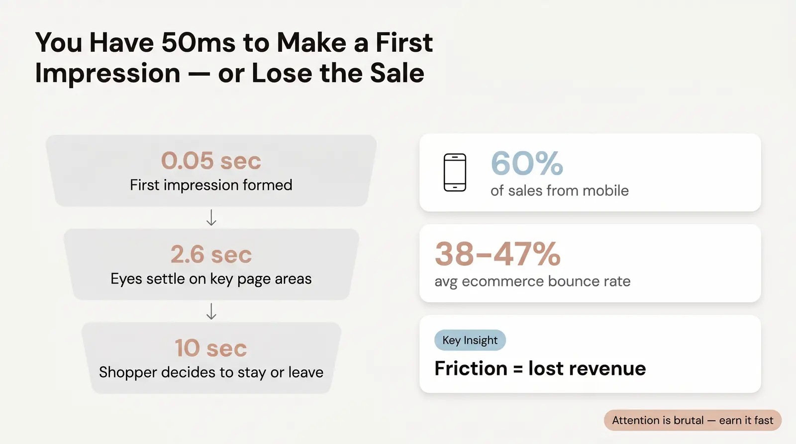
When a visitor lands on your ecommerce store, you have a fraction of a second to make an impression and about 10 seconds to confirm they are in the right place. Failing this test costs you dearly in high bounce rates, wasted ad spend, and lost revenue. Most store owners are too close to their own product to see the problem. They know their catalog inside and out, assuming the value is obvious to everyone else.
Most stores optimize for "looking professional" when shoppers actually need "immediately legible" — and those two goals frequently conflict. In fact, research shows that visual complexity can negatively impact first impressions, and users prefer simple, familiar designs [1]. A beautiful, abstract hero image with a clever but vague headline might win design awards, but it will confuse a first-time buyer. In our experience at Branvas, we often see new brand founders spend weeks on logo colors and zero minutes on their homepage headline.
The reality of online attention spans is brutal. It takes about 50 milliseconds for users to form an opinion about your website that determines whether they will stay or leave [1]. If they stay, it takes just 2.6 seconds for their eyes to settle on key areas of the page to gather information [1]. This is not just about reading speed; it is about cognitive ease, trust signals, and relevance confirmation.
When a shopper lands on your store, their brain is subconsciously asking: What is this? Is it for me? Can I trust them? If the answers require effort to find, the shopper leaves. The average bounce rate for ecommerce websites ranges between 38% and 47% [2]. For mobile users, the stakes are even higher, as 60% of ecommerce sales are made by mobile users, yet they face more friction and distractions [3]. Understanding your store means the shopper instantly grasps your value proposition without having to scroll or hunt for clues.
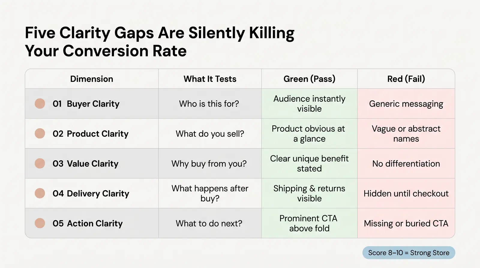
To help store owners diagnose their messaging, we developed the Branvas Clarity Score™. This is a proprietary five-dimension audit framework we use when reviewing brand stores for new clients. It serves as both a diagnostic tool and a scoring rubric to pinpoint exactly where you are losing visitors.
| Dimension | What to Look For | Green (2 pts) | Yellow (1 pt) | Red (0 pts) |
|---|---|---|---|---|
| Buyer Clarity | Target audience identification | Instantly clear who the product is for via text and imagery. | Target audience is implied but requires some reading to confirm. | Generic messaging; impossible to tell who the ideal customer is. |
| Product Clarity | Immediate product recognition | Product category and specific item are obvious at a glance. | Takes a few seconds of reading or scrolling to understand the product. | Vague, clever, or abstract descriptions obscure what is actually being sold. |
| Value Clarity | Unique value proposition | Explicit statement of why this product is better or different. | Value is hinted at through features but not clearly stated as a benefit. | No differentiation; relies solely on being another option in the market. |
| Delivery Clarity | Shipping and post-purchase info | Shipping speed, costs, and return policy are highly visible. | Information is present but buried below the fold or in a separate tab. | No mention of shipping or returns until the checkout page. |
| Action Clarity | Call to action visibility | Primary CTA is prominent, clear ("Buy Now"), and above the fold. | CTA is present but blends in or competes with secondary actions. | Missing CTA, hidden buttons, or confusing next steps. |
Score Interpretation:
The above-the-fold experience on your Shopify homepage is your single most important piece of digital real estate. This is the content visible without scrolling, and it must contain crucial information: a sharp headline, a supportive subheadline, an engaging hero image, trust signals, and a clear call to action (CTA) [4].
The most common above-the-fold failures on Shopify stores are shockingly basic. We frequently see vague headlines like "Welcome to our store," hero images that are purely decorative with no text, and entirely missing CTAs. If a user has to scroll to figure out what you sell or how to buy it, you have already lost them.
Before:
After (Branvas Clarity Score™: 10):
If you're building a jewelry or accessories brand from scratch, see how Branvas handles brand setup end-to-end — including storefront positioning.

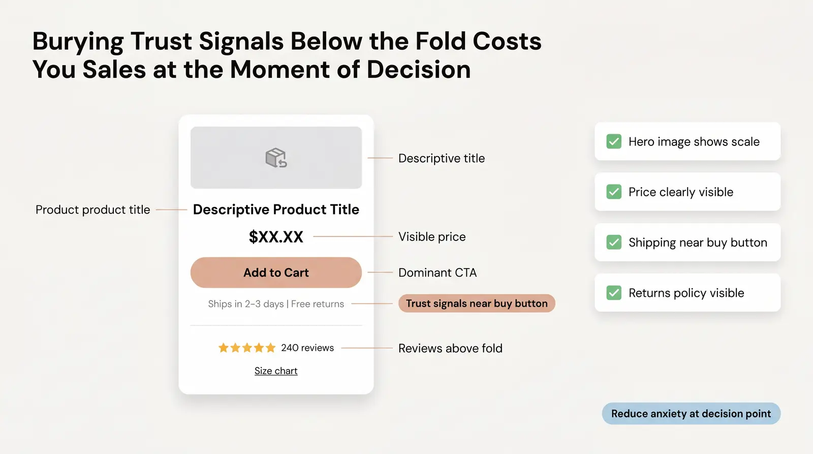
Product pages are where the actual buying decision happens, yet they often fail the clarity test. Applying the five dimensions here is critical. Your product title must be clear, the hero image must show scale (ideally on a human model for apparel and accessories) [5], and the description must articulate who it is for, what it does, and why they need it now. Trust signals like reviews and return policies must be highly visible.
A major, non-obvious failure on product pages is burying the most persuasive information. Many stores hide their shipping speed, guarantees, or sizing charts far below the fold. This information should be placed directly next to the "Add to Cart" button to reduce anxiety at the exact moment of decision.
Product Page Clarity Checklist:
You can run this clarity audit on your own store in under an hour. Here is the process:
At Branvas, when we onboard a new brand, one of our first steps is exactly this kind of clarity audit — because unclear positioning upstream means every downstream marketing dollar works harder than it needs to.

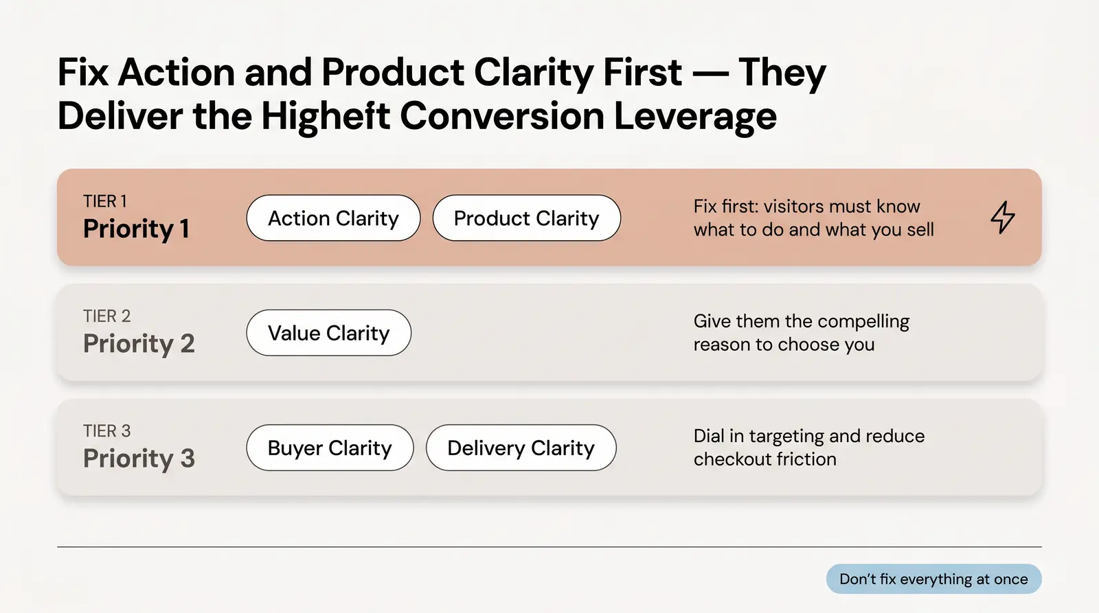
Once you have your scores, you must prioritize the fixes. Do not try to change everything at once.
First, fix Action Clarity and Product Clarity. These are your highest leverage points. You cannot convert visitors who do not know what to do, even if they understand what you sell. Ensure your "Add to Cart" buttons are prominent and your product titles are unmistakable.
Next, focus on Value Clarity. Once they know what you sell and how to buy it, give them the compelling reason to choose you over the competition. Finally, refine Buyer Clarity and Delivery Clarity to dial in your targeting and reduce last-minute checkout friction.
If your audit reveals that your brand foundation — product line, positioning, or packaging — is the root cause of your clarity problem, Branvas can help you build it right from the start. Private-label products, branded packaging, and blind fulfillment — handled.
What should be above the fold on a Shopify homepage?
Your Shopify homepage above the fold must include a clear headline stating what you sell, a subheadline with your unique value proposition, a prominent call to action (like "Shop Now"), and a high-quality hero image showing the product. Crucial trust signals, like free shipping banners or star ratings, should also be visible without scrolling.
How do I write a clear ecommerce value proposition?
A clear value proposition states exactly what your product is, who it is for, and how it solves a specific problem better than alternatives. Avoid jargon and clever slogans; instead, focus on concrete benefits. It should be readable and understood in under five seconds.
What is a good conversion rate for a Shopify store?
The average conversion rate for a Shopify store is between 1.4% and 1.8% [6]. Top-performing stores (the top 20%) achieve conversion rates above 3.2%, while the top 10% can see rates above 4.7%.
How do I test if my product page messaging is working?
The most effective way to test product page messaging is through qualitative feedback, such as a 5-second test where you show the page to someone unfamiliar with your brand and ask them to explain the product and its benefits. You can also use session recording tools to see if users are engaging with your descriptions or bouncing immediately.
Why are visitors leaving my store without buying?
Visitors typically leave without buying due to a lack of clarity, slow page load times, hidden shipping costs, or confusing navigation. If they cannot immediately understand what you sell or why they should buy it from you, they will bounce to a competitor's site.