


A clean Shopify design removes friction but doesn’t build buying confidence. Use the four-layer Buying Confidence Stack to diagnose and fix conversion gaps.
Published:
July 16, 2026
Author:
Yi Cui
A store can look polished and still fail to answer the buyer's real questions. It is a common frustration among new founders: you invest in a premium Shopify theme, source high-quality photography, and build a visually cohesive brand, yet the sales simply do not materialize. The problem is often a fundamental confusion between design quality and conversion readiness. For context, the average ecommerce conversion rate for luxury and jewelry brands hovers around 0.94% [1]. If your store is converting well below that benchmark, the issue is rarely aesthetic. In this article, we will explore why a clean design is not enough and how to build genuine buying confidence.
A visually appealing store is necessary, but it is not sufficient for driving sales. Good design serves a specific function: it removes friction. A clean layout ensures that navigation is intuitive, buttons are easy to find, and the site loads quickly. However, removing friction does not inherently create desire or trust. Those are entirely different jobs, handled by your copy, social proof, and clarity of offer.
In fact, an over-designed store can sometimes suppress conversion. When a website prioritizes aesthetic minimalism over essential information, it can make the products feel aspirational rather than attainable. The page begins to function like a brand advertisement rather than a practical buying environment [2]. In our experience at Branvas, we often see new sellers invest heavily in aesthetic before they've answered a single one of the buyer's core questions.
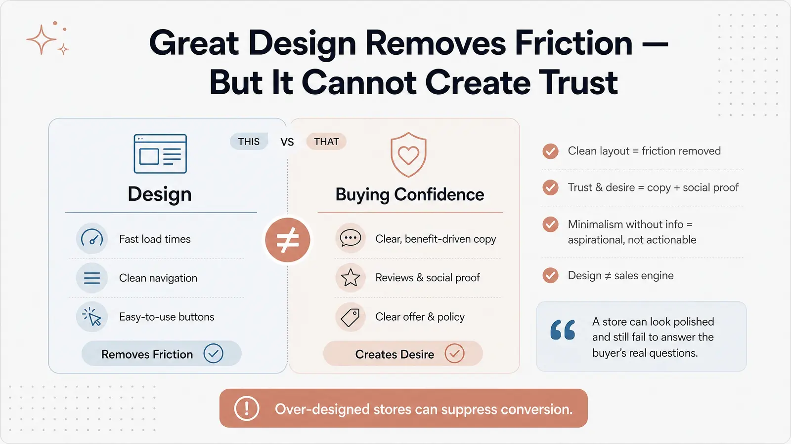
To diagnose why a visually clean store is failing to convert, we use a four-layer model called The Buying Confidence Stack™. This framework breaks down the essential elements required to turn a visitor into a confident buyer. Each layer represents a potential conversion gap.
| Conversion Gap | Common Symptom | Quick-Fix Action |
|---|---|---|
| Offer Clarity | High bounce rate on the homepage; visitors leave within seconds. | Rewrite the hero headline to state exactly what the product is and its primary benefit. |
| Social Proof | Traffic reaches product pages but does not add to cart. | Add a reviews app and seed it with initial genuine feedback or UGC. |
| Product Detail Depth | Visitors add to cart but abandon, or spend a long time on the page without buying. | Add a detailed FAQ section and specific sizing/material information to the product description. |
| Expectation Setting | Cart abandonment at the shipping calculation stage. | Display shipping costs, delivery times, and the return policy prominently near the "Add to Cart" button. |
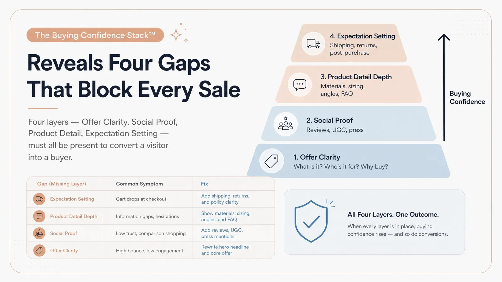
Consider this scenario: A founder launches a minimalist jewelry Shopify store. The theme is clean, the product photography is excellent, and the brand colors are cohesive. However, after 800 sessions, the conversion rate is a dismal 0.4%. Let us apply the Buying Confidence Stack™ to diagnose the issues.
We've seen stores like this at Branvas — beautiful execution, but the product page reads like a lookbook caption, not a sales page.
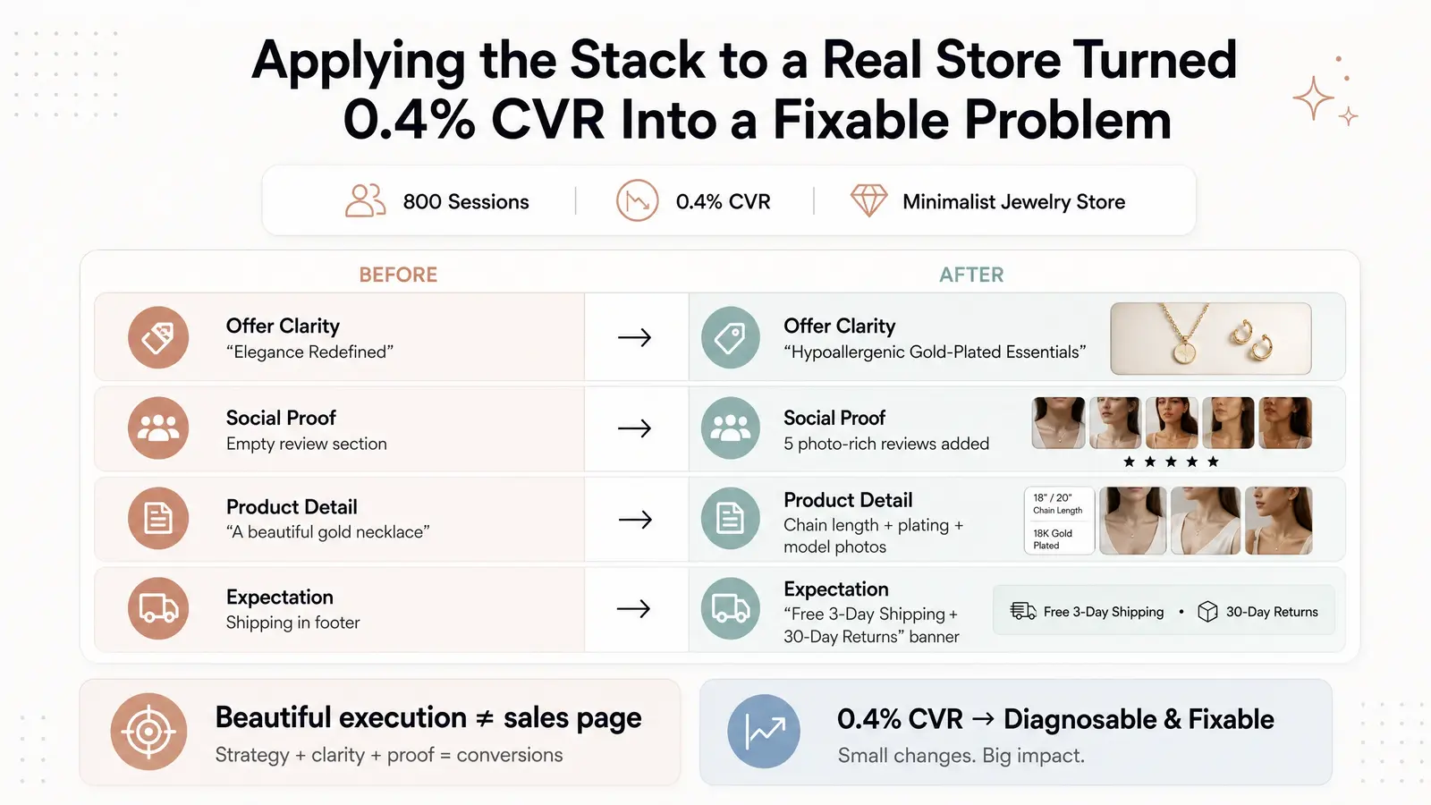
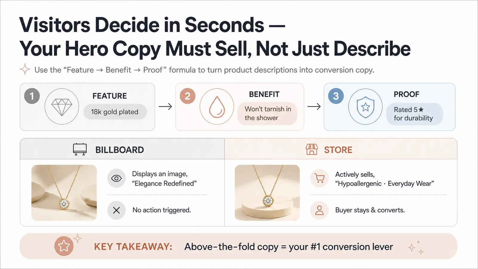
Offer clarity is the most foundational layer of the stack. A common mistake among ecommerce founders is writing copy that merely describes the product, rather than communicating its value to the buyer. Your store is not a billboard meant to simply display an image; it must actively sell.
Visitors typically decide whether to stay on a site within the first few seconds. If your above-the-fold content does not clearly articulate what you offer and why it matters, they will leave. A proven principle for rewriting product copy is the "feature → benefit → proof" structure. Instead of just listing a feature (e.g., "18k gold plated"), explain the benefit ("won't tarnish in the shower") and provide proof ("rated 5 stars for durability"). Clear value propositions are critical for matching user motivation with the offer [3].
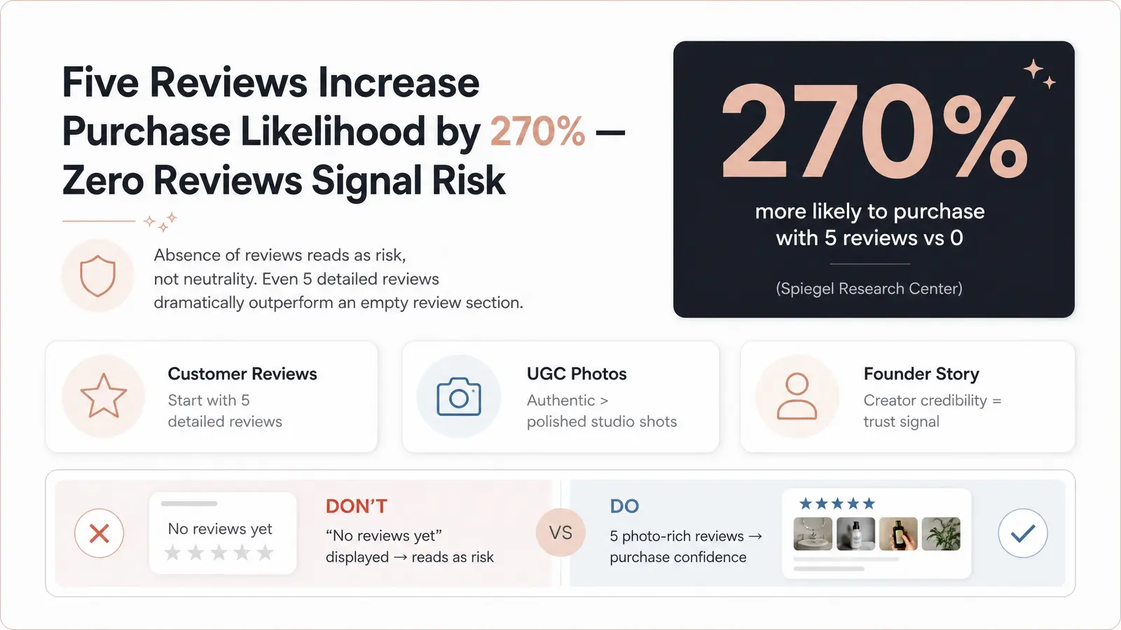
The psychology of social proof in ecommerce is powerful. When buyers cannot physically inspect a product, they rely heavily on the experiences of others. Displaying "No reviews yet" is often more damaging than having a slightly dated website design. Absence of proof reads as risk, not neutrality.
Research from the Spiegel Research Center demonstrates that the purchase likelihood for a product with five reviews is 270% greater than for a product with no reviews [4]. Furthermore, user-generated content (UGC) often outperforms highly polished studio photography because it feels authentic and trustworthy. For creator-led brands, the founder's credibility also serves as a significant trust signal.
If you're launching a jewelry or accessories brand and want products that are actually worth reviewing — products with quality that earns real 5-star feedback — explore Branvas's product catalog to see what's possible.
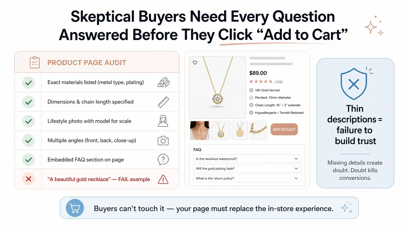
Ecommerce buyers are inherently skeptical. They cannot touch the fabric, feel the weight of the metal, or try on the item. Therefore, your product page must anticipate and answer every question on their mental checklist.
A robust product page requires comprehensive details: exact materials, dimensions, and honest sizing guidance. Visuals are equally important; you need multiple angles, including lifestyle shots and images that clearly show the product's scale on a human model [5]. Thin product descriptions are not just a copywriting oversight; they represent a failure to build trust. An embedded FAQ section directly on the product page can preemptively address common objections and keep the buyer focused on purchasing.
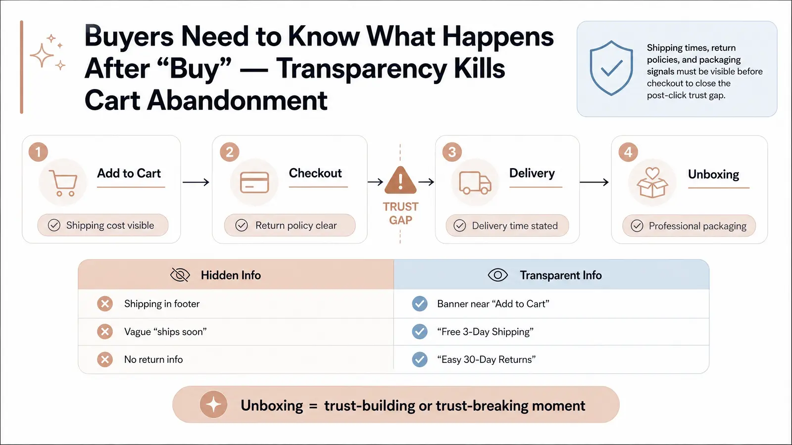
Conversion is not solely about the product; it is also about the transaction experience. Buyers need to know what happens after they complete their purchase. Key questions include: How long will shipping take? What is the return policy? Is this brand legitimate?
Transparency regarding shipping times and return policies is crucial for reducing cart abandonment [6]. Additionally, the brand story and the anticipated unboxing experience contribute to perceived legitimacy. For new or small brands, professional packaging is a strong trust signal that reduces buyer's remorse and encourages repeat purchases.
At Branvas, branded packaging and blind shipping are built into the model — because we know that the moment a buyer opens their order is a moment of trust-building or trust-breaking. See how our fulfillment model works.
Use this checklist to evaluate your store against the Buying Confidence Stack™:
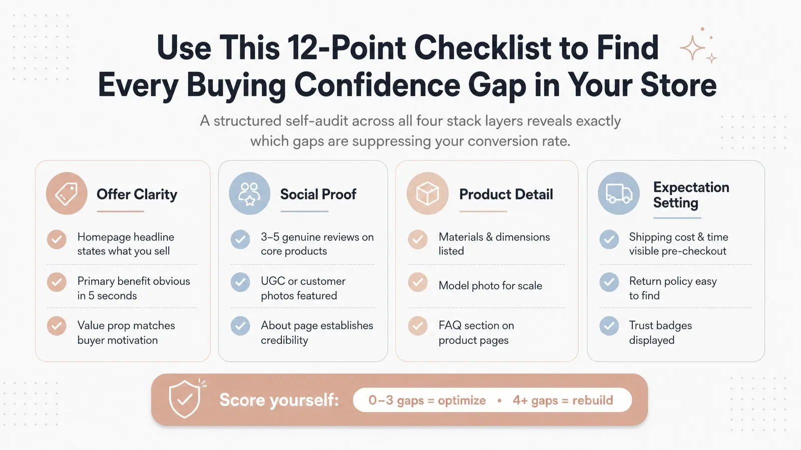
High traffic with no sales usually indicates a disconnect between the visitor's expectations and what the store provides. While the design may be clean, the site might lack clear offer messaging, sufficient social proof, or detailed product information, leaving the buyer hesitant to complete the purchase.
You can identify product page issues by looking at your analytics. If visitors are reaching the product page but not adding items to their cart, or if they spend a long time on the page without taking action, it suggests that their pre-purchase questions are not being answered. A lack of detail, poor imagery, or missing reviews are common culprits.
Conversion rates vary significantly by industry and price point. However, a general benchmark for ecommerce is around 1.5% to 2.5%. For specific niches like luxury and jewelry, the average is often lower, around 0.94% [1]. A new store should aim to reach the 1% mark as a baseline before optimizing further.
You do not need hundreds of reviews to establish trust. Research shows that having just five reviews can increase the likelihood of purchase by 270% compared to having zero reviews [4]. Focus on acquiring a small number of detailed, high-quality reviews for your core products first.
Yes, but primarily by removing friction. A good design ensures the site is easy to navigate, loads quickly, and looks professional. However, design alone cannot persuade a customer to buy. It must be paired with strong copy, clear value propositions, and robust trust signals to effectively drive conversions.
A clean, professional design is the entry ticket to ecommerce, not the sales engine itself. If your store looks beautiful but fails to convert, it is time to shift your focus from aesthetics to buying confidence. By applying the Buying Confidence Stack™—ensuring offer clarity, providing social proof, deepening product details, and setting clear expectations—you can transform a visually pleasing site into a high-converting storefront.
If you're building a jewelry or accessories brand and want to launch with the product quality, packaging, and fulfillment infrastructure that supports real buying confidence from day one — learn how Branvas works or browse the catalog.
[1] Ecommerce Conversion Rate: How To Improve Yours (2026)
[2] Why Conversion Rate Alone is Misleading (And What to Track Instead)
[3] Unique Value Proposition: How to Create a UVP (With 7 Examples)
[4] From Reviews to Revenue
[5] Product Page UX 2026: 10 Pitfalls and Best Practices
[6] How Shipping Impacts eCommerce Conversion Rate Optimization (CRO)