High contact-page traffic reveals unanswered pre-purchase questions. Use the Branvas Question Audit Framework to move answers onto product pages and convert hesitant visitors into buyers.
Published:
June 29, 2026
Author:
Yi Cui
You are looking at your Shopify analytics. Traffic is decent. People are landing on product pages. But sales are not following. And there, buried in your page-by-page report, is something that should not be getting that many visits: your contact page.
We often see sellers panic when they see contact-page traffic spike. But that spike is actually one of the most useful data signals you can get. It means your visitors have purchase intent. They are close to buying. They just hit a wall.
This is a conversion diagnostic article. Not a generic CRO listicle. The goal is to help you read what your contact-page traffic is actually telling you, and then systematically eliminate the friction that is keeping shoppers from converting.
Every visit to your contact page before a purchase represents a question your product page failed to answer.
Think about what it takes for a shopper to navigate away from a product page, find your contact link, open a form, type out a question, and submit it. That is not casual browsing behavior. That is a motivated buyer who ran out of information at the worst possible moment.
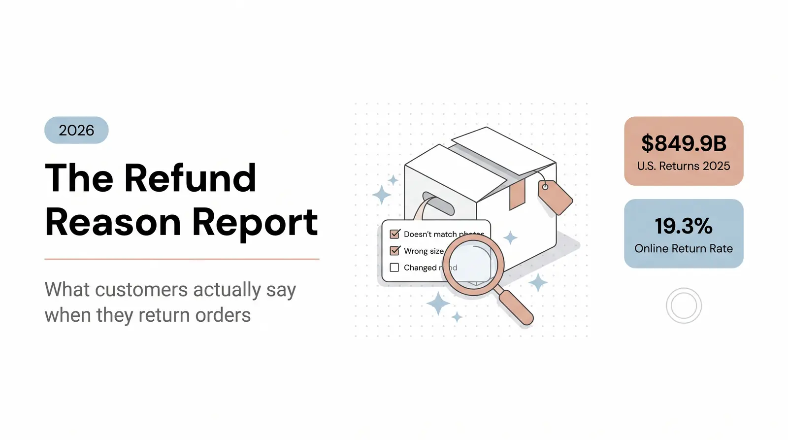
According to the Baymard Institute, the average documented cart abandonment rate is 70.22%, and a significant share of that abandonment is driven by resolvable friction: unclear shipping costs, missing return policy details, and product information gaps that leave shoppers uncertain [1]. When shoppers cannot find what they need on the page, they either leave or reach out. Contact-page traffic is the group that chose to reach out. The rest just left.
Here is the contrarian insight most store owners miss: hiding or minimizing your contact page does not fix the problem. In fact, it makes things worse. Shoppers want to know that help is available. A visible, accessible contact page is a trust signal. The goal is not to make contact harder. The goal is to make self-service faster, so shoppers never need to contact you in the first place.
The problem is not that your contact page exists. The problem is that it is being used as a product page.

The questions sitting in your contact form are not random. They cluster into predictable categories, and each category points to a specific gap in your on-site content.
In our experience working with new jewelry brand founders, the single most common contact-form question is not about price. It is about materials and skin sensitivity. "Will this turn my neck green?" "Is this hypoallergenic?" "What is the chain made of?" These are not edge-case questions. They are the questions that block the sale.
Here is a breakdown of the most common pre-purchase question categories, what shoppers actually say, and where the answers belong:
| Question Category | Typical Customer Phrasing | Where the Answer Belongs |
|---|---|---|
| Shipping and Delivery | "How long does shipping take?" / "Do you ship to Canada?" | Product page (near Add to Cart), Shipping Policy page, FAQ |
| Product Fit and Sizing | "Will this 18-inch chain fall at my collarbone?" / "Is this ring true to size?" | Product page (size guide, in-scale model photos, chain length graphic) |
| Materials and Care | "Will this turn my skin green?" / "Is this hypoallergenic?" | Product page (materials section, care instructions) |
| Returns and Refunds | "What if it does not fit? Can I return it?" / "How long do I have to return?" | Product page (return policy snippet), Returns Policy page, FAQ |
| Authenticity and Brand Trust | "Is this real gold?" / "Where is this made?" / "Is this a real brand?" | Product page, About Us page, FAQ |
| Customization and Options | "Can I get this in a longer chain?" / "Do you do custom engraving?" | Product page (variant options), FAQ, Contact (for genuine custom requests only) |
When you look at your contact inbox through this lens, it stops being a support queue and starts being a research dataset. Every question is a conversion that almost happened.

To turn this data into action, you need a repeatable system. The Branvas Question Audit Framework (BQAF) is a four-step process for mining your contact-form submissions as conversion intelligence.
Step 1: Collect and Categorize
Pull all contact-form submissions from the last 30 to 90 days. Export them into a spreadsheet and tag each one by theme: shipping, materials, sizing, returns, trust, or customization. Count the frequency of each category. You are looking for the themes that appear repeatedly, because those are the gaps that are costing you the most sales.
Step 2: Score by Friction Weight
Not all questions carry the same conversion risk. Assign each question category a friction score from 1 to 5 based on how directly it blocks a purchase decision.
A question like "Do you ship to Canada?" scores a 5 out of 5. If the shopper is in Canada and cannot confirm you ship there, the sale is dead. A question like "What is your Instagram?" scores a 1 out of 5. It is curious, not critical.
Prioritize the high-friction questions first. They are the ones generating the most revenue leakage.
Step 3: Map to the Customer Journey Stage
Determine where the shopper is in their decision process when they ask the question. Shipping and returns questions tend to come from shoppers in the decision stage, right at the edge of purchasing. Materials and sizing questions often come from the consideration stage. Trust and authenticity questions can appear at any stage, but they are especially damaging early in the journey.
Knowing the stage helps you decide not just what to say, but where to say it.
Step 4: Deploy Answers to the Right On-Site Location
Move the answers out of your inbox and onto the pages where shoppers are actually looking for them. The next section covers exactly where each type of answer belongs.
Worked Example: Aurelle Studio
Consider Aurelle Studio, a fictional jewelry brand that ran the BQAF on 60 days of contact-form submissions. Of their incoming messages, 40% were asking about necklace chain length and materials. Shoppers wanted to know if an 18-inch chain would sit at the collarbone, whether the gold-filled finish was hypoallergenic, and how to care for the pieces.
Aurelle Studio took four actions. First, they added a materials callout directly below the product title on every necklace listing: "14k Gold-Filled, Hypoallergenic, Nickel-Free." Second, they created a chain-length comparison graphic showing how 16, 18, 20, and 24-inch chains fall on a model. Third, they added an expandable FAQ accordion to the product page with the five most common questions. Fourth, they updated their shipping page to include handling times and carrier information.
The result: contact-page traffic dropped by approximately 30% over the following six weeks. Conversion rate on their necklace pages improved, because shoppers could now answer their own questions without leaving the product page.

The audit tells you what questions are being asked. This section tells you where to put the answers.
Your product page is the most important real estate on your site. It is where the purchase decision is made, and it is where most pre-purchase friction lives.
Above the fold, near the "Add to Cart" button, include the information that directly affects the buying decision: price, materials, available sizes or variants, and a one-line shipping estimate. Shoppers should not have to scroll to find out whether you ship to their country or whether the metal is hypoallergenic.
Below the fold, use expandable tabs or accordion sections for deeper information: full materials breakdown, care instructions, size guides, and return policy. This keeps the page clean while making detailed information accessible. Baymard Institute's product page research confirms that 62% of leading ecommerce sites have mediocre or worse product page UX, and a significant driver of that is missing or hard-to-find product details [2].
For jewelry and accessories specifically, include at least one in-scale model photo showing how the piece sits on the body. Baymard's testing found that 42% of users try to determine product size from images, and without a reference point, they abandon the product rather than guessing [2].
A dedicated FAQ page handles the questions that apply to your store broadly, not to a single product. Think shipping policies, return windows, wholesale inquiries, and brand background.
Structure the page by category, not alphabetically. Shoppers scanning for a shipping question should not have to read through returns and sizing content first. Use accordion-style questions so the full page is scannable. Add FAQ schema markup to your page so individual questions can appear as rich results in Google search, which extends your reach to shoppers who are searching for answers before they even visit your site [3].
For Shopify stores, you can also explore Branvas Academy for guidance on building out your product content and brand assets.
Shipping anxiety is one of the highest-friction points in ecommerce. According to Baymard Institute, 39% of shoppers who abandon carts cite extra costs as the reason, and 21% cite delivery being too slow [1]. Both of these are driven by unclear or late-disclosed shipping information.
Do not bury your shipping details in a policy page that no one reads. Surface the key information: estimated handling time, carrier options, delivery window, and whether you ship internationally. State your return window clearly and make the process sound easy, not punitive.
If you are launching a private-label jewelry brand and shipping logistics are generating the most contact-form questions, Branvas's blind fulfillment model removes that variable entirely. Your customers see your brand, your packaging, and your shipping confirmation. The operational complexity is handled on the back end.
Your automated email sequences are an underused channel for addressing pre-purchase objections. Most abandoned cart emails lead with a discount. The better approach is to lead with an answer.
In your abandoned cart flow, address the most common friction points directly. "Still thinking about it? Here is what you should know: all our pieces are hypoallergenic, and we offer free returns within 30 days." In a browse abandonment flow, reinforce the specific product the shopper viewed and answer the question they were most likely asking. In a welcome sequence, use the second or third email to proactively address your most common pre-purchase questions before the shopper even has a chance to ask them.
Klaviyo's research on abandoned cart behavior confirms that returns policy clarity and product information are among the top reasons shoppers hesitate at checkout [4]. Addressing these objections proactively in email flows converts passive hesitation into active reassurance.

A contact page will always exist, and it should. Shoppers who see a contact page know that a real business is behind the site. Removing it or making it hard to find increases purchase anxiety, not decreases it.
The goal is not to eliminate contact. The goal is to make self-service so easy that most shoppers never need it.
A few practical ways to do this: add a short "Before you contact us" section at the top of your contact page that links to your FAQ, your shipping policy, and your size guide. Use a smart contact form with topic-based dropdowns, so when a shopper selects "Shipping Question," the form surfaces the answer before they submit. Add a visible FAQ widget to your product pages so shoppers can get answers without leaving the page.
According to HubSpot, 78% of CRM leaders say customers prefer to solve issues independently, and 60% of software users prefer self-service options [3]. Shoppers do not want to wait for a reply. They want the answer now. Give it to them on the page.
If you are building a product line from scratch and want to avoid common fulfillment and product-information gaps before they reach your inbox, explore how Branvas works.

Measuring the impact of these changes requires tracking the right numbers. Here is what to watch:
| Metric | What It Measures | What to Look For |
|---|---|---|
| Contact-page visit rate (% of total traffic) | How often shoppers seek help vs. self-serve | A steady decline after content updates |
| Product page conversion rate | Whether updated pages convert better | Lift on pages where you added materials, sizing, or FAQ content |
| Contact form submission volume by category | Whether specific question types are declining | Fewer "what is this made of" or "do you ship to X" submissions |
| FAQ page engagement (scroll depth, accordion clicks) | Whether shoppers are using the self-service content | High engagement means the content is relevant and being found |
| Abandoned cart email click-through rate | Whether objection-handling in email is resonating | Higher CTR on emails that address specific product questions |
A healthy ecommerce store should see contact-page traffic below 2 to 3% of total sessions. If you are seeing 5% or more, that is a signal worth investigating. Track this number monthly and correlate it with any content changes you make to product pages or your FAQ.
If you are launching a jewelry or accessories brand and want your product pages, shipping copy, and brand packaging to be conversion-ready from day one, not patched together after your contact inbox fills up, see how Branvas builds brands that are ready to sell.

Visitors navigate to your contact page because they have a specific pre-purchase question that your product page did not answer. This is almost always about shipping, returns, materials, or sizing. The shopper has purchase intent, but they are experiencing friction. They need one more piece of information before they feel confident buying. If that information is not on the product page, they will either contact you or leave. Contact-page traffic is the group that chose to reach out rather than abandon.
The most frequent pre-purchase questions cluster around five themes: shipping times and costs, return policies and windows, product materials and safety (especially for jewelry and accessories), sizing and fit, and brand authenticity. For jewelry brands specifically, questions about hypoallergenic materials and chain length are among the most common. Addressing these on the product page, rather than waiting for shoppers to ask, removes the friction that prevents conversion.
Never hide your contact page. Its visibility is a trust signal. Instead, reduce the volume of unnecessary inquiries by moving the answers to common questions directly onto your product pages, FAQ, and shipping copy. Add self-service deflectors to the contact page itself, such as links to your FAQ or a smart form that surfaces answers based on the topic selected. The goal is to make self-service faster and easier, not to make contact harder.
Both, but divided by scope. Product-specific questions, such as materials, sizing, care instructions, and variant options, belong on the product page where the purchase decision is being made. General store questions, such as your return window, shipping carriers, international availability, and wholesale inquiries, belong on a dedicated FAQ page. Putting everything on a separate FAQ page means shoppers have to leave the product page to get answers, which adds friction at the worst possible moment.
When shoppers can find the answer they need on the page they are already on, they do not need to contact you. They proceed to checkout instead. The reduction in contact-form volume is a direct result of removing the information gap that was causing the friction. Brands that run a structured content audit, like the Branvas Question Audit Framework, typically see measurable reductions in contact-page traffic within four to eight weeks of deploying answers to the right on-site locations.
[1] Baymard Institute: 50 Cart Abandonment Rate Statistics
[2] Baymard Institute: Product Page UX 2026 — 10 Pitfalls and Best Practices
[3] HubSpot: 13 Customer Self-Service Stats That Leaders Need to Know
[4] Klaviyo: Abandoned Cart Emails — Components and Best Practices
[5] WooCommerce: Why Your Store's FAQ Page Is More Important Than You Think
[6] Salsify: How To Kick Shopping Cart Abandonment to the Curb
[7] The Good: Why Your Product Page Isn't Converting (and How to Fix It)