This guide covers color psychology, typography, logo strategy, and a brand identity scorecard to help jewelry founders design a high-end visual identity for 2026.
Published:
April 3, 2026
Author:
Yi Cui
Is your brand's visual language saying "luxury" or "low-budget"? In a saturated jewelry market, visual identity is often the only differentiator before a customer clicks "buy." When a shopper lands on your website or scrolls past your Instagram ad, they make a split-second judgment about the quality, price, and desirability of your pieces based entirely on your branding. If your fonts feel dated, your colors clash, or your logo looks like a generic template, even the most exquisite jewelry will struggle to command a premium price.
The difference between a brand that looks like a hobbyist's side project and one that looks like a funded, high-end boutique often comes down to a few strategic design choices. Building a cohesive, premium visual identity requires understanding the psychological signals that colors and typography send to your target buyer. It is about creating a visual ecosystem that elevates the perceived value of your products and builds immediate trust.
This guide covers color psychology, typography, logo strategy, and a practical framework any founder can use to evaluate their brand. Whether you are launching a new line or refreshing an existing one, these insights will help you design a jewelry brand that looks high-end, attracts buyers in 2026, and positions your business for long-term growth.
Brand design directly affects perceived value, price elasticity, and conversion rate. When a customer evaluates a piece of jewelry online, they cannot touch the metal, feel the weight of the stone, or try it on. They rely entirely on visual cues to determine if a $150 necklace is actually worth $150. A strong, cohesive brand identity acts as a multiplier for perceived value, allowing you to command higher margins and reducing the friction in the purchasing process. Research published in the Journal of Consumer Research demonstrates that color choices alone directly influence a consumer's willingness to pay and their perception of a luxury brand's status. [1]
Here is the non-obvious insight most founders miss: most first-time jewelry founders over-invest in product photography and under-invest in brand identity. Yet branding dictates whether your photography looks like a $30 Etsy listing or a $300 boutique product. You can hire the best photographer in the world, but if those stunning images are placed next to a cheap-looking logo and amateur typography, the overall effect is compromised. The brand identity provides the context that makes the photography work. It sets the stage, establishes the mood, and tells the customer exactly how they should feel about the product before they even read the description.
In our experience at Branvas, the founders who come to us having already mapped their visual identity launch faster and convert better from day one. They spend less time agonizing over minor website tweaks and more time focusing on growth, because their brand foundation is solid. A well-designed brand is not just a cosmetic upgrade. It is a strategic asset that drives revenue and builds customer loyalty.

Color is the first psychological cue a customer receives about your brand. It communicates your positioning, your target audience, and your brand's personality instantly. According to widely cited consumer research, up to 85% of shoppers name color as the primary reason they purchase a product. [2] We often see founders choose colors they personally love rather than colors their target buyer responds to, and there is a meaningful difference. Understanding the emotional signals of different palettes is crucial for creating a brand that resonates with your ideal customer.
Gold vs. Silver Palettes. Gold and silver send fundamentally different psychological signals. Gold is the color of success, affluence, and warmth. It harnesses a sense of opulence and traditional luxury, evoking feelings of prestige and enduring value. [2] Brands leaning into heritage or high-end fine jewelry often utilize gold accents to signal authority. Silver, on the other hand, communicates cool precision, modernity, and technological sophistication. It feels cleaner and more accessible, making it a popular choice for contemporary, minimalist brands or gender-neutral positioning.
Black + White. A black and white palette is the ultimate signal of timeless luxury and high contrast. Black conveys elegance, power, and wisdom, while white suggests purity, simplicity, and transparency. [2] This combination creates an editorial feel that allows the jewelry itself to take center stage. It is highly versatile and works beautifully across all touchpoints, from packaging to digital interfaces.
Blush + Nude Tones. Blush and nude tones communicate femininity, approachability, and softness. This palette has massive appeal among millennial and Gen Z consumers who gravitate toward "everyday luxury." Brands like Mejuri and Gorjana have successfully used these soft hues to build cult-like followings, positioning their jewelry as accessible, wearable, and intimately connected to the wearer's daily life.
Deep Jewel Tones. Deep jewel tones such as emerald, sapphire, and burgundy convey richness, heritage, and maximalist luxury. These highly saturated colors evoke a sense of history and craftsmanship. Cartier's iconic deep red packaging is a prime example of how a jewel tone can become synonymous with treasure and enduring love. [2] These colors work exceptionally well for brands that want to project authority and traditional opulence.
Earth Tones + Natural Palettes. Earth tones and natural palettes signal sustainability, artisan authenticity, and conscious luxury. As consumers increasingly prioritize ethical sourcing and environmental responsibility, colors like moss green, warm clay, and soft ochre communicate a connection to nature. This palette is ideal for brands focusing on recycled metals, lab-grown diamonds, or artisan craftsmanship, aligning the visual identity with the brand's core values.
We often see founders choose colors they personally love rather than colors their target buyer responds to, and there is a meaningful difference. The table below is designed to help you match your palette to your positioning with intention.
| Palette | Emotional Signal | Target Buyer Persona | 2026 Trend Fit | Example Brand |
|---|---|---|---|---|
| Cloud Dancer (Soft White) | Clarity, calmness, fresh start | The mindful minimalist seeking quiet luxury | High | M. Robinson Fine Jewelry |
| Deep Burgundy and Gold | Heritage, opulence, enduring value | The traditional luxury buyer | Medium | Cartier |
| Blush and Warm Nude | Approachability, everyday femininity | The millennial/Gen Z "everyday luxury" shopper | High | Mejuri, Gorjana |
| Matte Black and Crisp White | Editorial authority, timeless elegance | The fashion-forward, premium buyer | High | Chanel Fine Jewelry |
| Moss Green and Clay | Sustainability, artisan authenticity | The conscious, eco-minded consumer | High | Emerging ethical brands |
| Silver and Cool Grey | Modernity, precision, gender-neutrality | The contemporary, urban minimalist | Medium | Modern DTC brands |

Typography is the silent ambassador of your brand. It dictates the tone of your messaging and heavily influences how premium your brand feels. At Branvas, when we help founders build out their brand studio assets, typography is consistently the element that separates a brand that looks funded from one that looks homemade. There are three primary type personalities in jewelry branding, each serving a distinct strategic purpose.
The Editorial Serif signals authority, heritage, and traditional luxury. These fonts often feature high contrast between thick and thin strokes, evoking the feel of high-end fashion magazines. The Geometric Sans-Serif communicates a modern, minimal, and clean aesthetic. It is highly legible and feels contemporary, making it a favorite for accessible luxury brands. Finally, the Script or Calligraphy font suggests romance, bespoke craftsmanship, and artisan quality, though it must be used sparingly to avoid looking dated or illegible at small sizes.
What makes a font feel "cheap" versus "premium"? It often comes down to letter spacing (kerning and tracking), weight contrast, and historical associations. Overused system fonts like Arial or Times New Roman lack distinction and signal a lack of investment in the brand's identity. Research from Monotype found that 80% of luxury fashion brands use a serif typeface in their logo, while 70% rely on a geometric sans-serif as their primary body font. [3] Conversely, premium fonts feature elegant proportions and refined details that hold up beautifully across both digital screens and physical packaging.
The following eight fonts are well-suited to jewelry brands at different price points and positioning:
| Font | Type | Cost | Best For |
|---|---|---|---|
| Cormorant Garamond | Old-style serif | Free (Google Fonts) | Heritage, fine jewelry, traditional luxury |
| Canela | Display (between serif and sans) | Premium (Commercial Type) | Contemporary editorial, modern boutique |
| Didot | High-contrast serif | Premium | Couture luxury, fashion-adjacent brands |
| Bodoni | Modern serif | Premium | Timeless elegance, heritage positioning |
| Playfair Display | High-contrast serif | Free (Google Fonts) | Sophisticated headings, editorial feel |
| Montserrat | Geometric sans-serif | Free (Google Fonts) | Accessible luxury, clean body copy |
| Proxima Nova | Humanist sans-serif | Premium | Modern legibility, approachable luxury |
| Freight Display | Elegant serif | Premium | Boutique brands, personality-driven identity |
Font pairing recommendations. For a contemporary fine jewelry brand, pair Canela (display) with Montserrat (body). For a heritage brand, pair Cormorant Garamond (display) with Proxima Nova (body). For a maximalist or fashion-forward brand, pair Didot (display) with Futura (body).
Worked Example: The "Lune Atelier" Test. Imagine a fictional jewelry brand called "Lune Atelier." Setting the logo and primary headings in Canela with Montserrat for body copy instantly creates the feel of a high-end, contemporary boutique. The ambiguity of Canela provides editorial flair, while Montserrat ensures the product descriptions are clean and readable. Now, imagine setting "Lune Atelier" in Comic Sans with Impact for the body copy. The contrast is absurd, but it viscerally illustrates the point: the words are exactly the same, but the perceived value of the jewelry drops to zero based entirely on the typography.

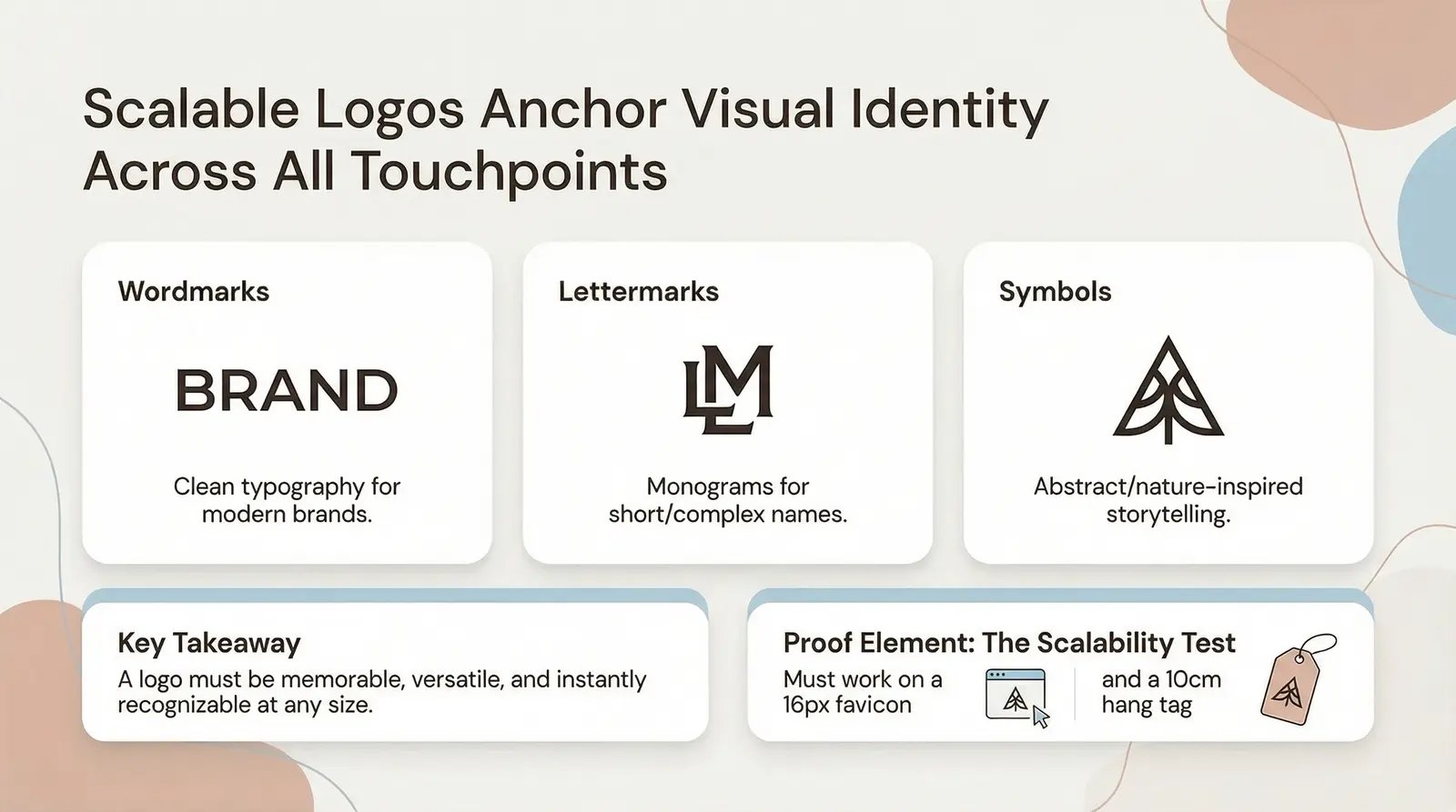
A jewelry logo is the anchor of your visual identity. It must be memorable, versatile, and instantly recognizable. There are three primary approaches to jewelry logo design, and the right choice depends entirely on your brand name and positioning.
Wordmark logos are highly effective when you have a strong, distinctive brand name and clean typography. They rely entirely on the font to communicate the brand's personality. This approach is excellent for modern, minimalist brands that want the jewelry to speak for itself. Pandora's clean sans-serif wordmark is a strong example of how a typographic logo can feel approachable yet sophisticated across both digital and physical applications.
Lettermark logos, which use initials or a monogram, are ideal for short or complex names. They feel personal, luxurious, and timeless. A well-designed monogram can become an iconic symbol in its own right, much like the interlocking Cs of Chanel or the LV of Louis Vuitton. They are highly scalable and work beautifully on small surfaces like jewelry tags or inside rings.
Symbol and icon logos add a layer of visual storytelling. While obvious symbols like diamonds or rings are often oversaturated in the jewelry market, more abstract or nature-inspired elements can be highly effective. In 2026, the trend is moving toward celestial motifs, botanical elements, and geometric abstraction. These symbols connect to the natural materials used in jewelry while creating a unique visual identity. [4] Geometric shapes carry specific meaning: circles suggest completeness and unity (ideal for wedding jewelry), triangles communicate aspiration, and hexagons imply precision and craftsmanship.
The scalability test. A critical test for any jewelry logo is scalability. Your logo must work on a massive storefront sign, a website favicon, an Instagram profile photo, and an embossed 10cm hang tag. If your logo relies on fine details or intricate gradients, it will become an illegible blur when scaled down. Design for the smallest application first, ensuring the core shapes and typography remain clear and distinct. This is one of the most common mistakes in jewelry logo design, and it is entirely avoidable.
What to avoid. Clip-art gems, gradient overload, and using more than two fonts in a single logo instantly cheapen the brand. Illegible scripts at small sizes are another common pitfall. If a customer cannot read your brand name on a mobile screen, you have already lost them.
Tools for logo design. For founders on a tight budget, Canva offers entry-level options, though they often lack the uniqueness required for a premium brand. Adobe Illustrator and Linearity Curve provide professional-grade vector design capabilities. AI-driven platforms like Looka can generate concepts quickly. Working with a professional brand designer on platforms like 99designs or Dribbble often yields the best results for a truly bespoke identity.
If you're building your jewelry brand from scratch, Branvas's Brand Studio helps you develop a cohesive visual identity — from logo concepts to packaging — all aligned with your target market. Explore the Brand Studio →
We built this scorecard internally at Branvas after noticing that most brand identity problems, the ones that quietly kill conversion rates, fall into one of these six categories. Use this framework to self-audit your brand before launch. Score each dimension honestly from 1 (needs significant work) to 5 (excellent).
| Dimension | What to Evaluate | Score (1–5) | Notes |
|---|---|---|---|
| Color Cohesion | Does your palette consistently signal your intended brand positioning? | ||
| Typography Hierarchy | Do you have a clear display font and body font pairing that feels intentional? | ||
| Logo Versatility | Does your logo work at 16px favicon AND on a 10cm hang tag? | ||
| Packaging Alignment | Does your packaging reinforce your brand's price positioning? | ||
| Brand Voice Consistency | Does your visual brand match your written tone and copy? | ||
| Competitor Differentiation | Does your brand look distinctly different from the top 5 competitors in your niche? |
Scoring guide: A score of 24–30 means you are launch-ready, with a cohesive, premium, and strategically aligned identity. A score of 16–23 means you should refine before launch; identify the weak dimensions and address them to maximize conversion. A score under 16 means a redesign is recommended, as your current visual identity is likely to hinder sales and damage perceived value.

Staying ahead of design trends ensures your brand feels relevant and contemporary. The following five trends are shaping jewelry brand design in 2026, with a clear signal on whether to act now or monitor from a distance.
1. Quiet Luxury (Build Now). Defined by refined design, high-quality materials, and a distinct lack of flashy logos, quiet luxury emphasizes understatement and timeless elegance. This trend appeals to consumers seeking enduring value over conspicuous consumption. Visually, it translates to restrained palettes, elegant serif typography, and minimal iconography. [5]
2. Organic Maximalism (Watch and Wait). A counter-movement to minimalism, organic maximalism trades pastel shades for high-saturation, ethically sourced gemstones like emeralds and cognac diamonds. It mixes bold colors with natural materials, targeting the expressive, fashion-forward buyer. The visual identity for brands in this space tends to be rich, layered, and deeply textured. [6]
3. Cloud Dancer and White Neutrals (Build Now). Pantone's 2026 Color of the Year, "Cloud Dancer" (PANTONE 11-4201), is a soft white that symbolizes clarity, calmness, and a fresh start. This lofty neutral acts as a blank canvas, perfect for creating serene, sophisticated retail and digital environments. It pairs beautifully with brushed nickel, champagne gold, or matte black accents. [7]
4. Evolved Minimalism (Build Now). A more refined interpretation of minimalism, this trend focuses on essential silhouettes crafted with precision. Visually, it translates to clean, airy layouts, generous white space, and a single strong typographic statement. Brands targeting the everyday fine jewelry customer will find this aesthetic highly effective. [8]
5. Sustainability Aesthetics (Build Now). Visual identities that signal ethical sourcing and environmental responsibility through earth tones, natural palettes, and transparent messaging are gaining significant traction. As searches for ethical gold and recycled metals climb sharply, brands that communicate their values visually, not just verbally, will earn a meaningful competitive advantage. [9]

What colors are best for a luxury jewelry brand?
The best colors depend on your specific positioning. Traditional luxury often utilizes gold, deep jewel tones like emerald and burgundy, or high-contrast black and white. Contemporary or "quiet luxury" brands frequently lean toward soft neutrals, blush tones, or cool silver to signal modernity and approachability. The key is matching your palette to your target buyer's expectations, not your personal preferences.
What font do most high-end jewelry brands use?
High-end jewelry brands heavily favor elegant serif fonts for their logos, such as Didot, Bodoni, or custom high-contrast typefaces. For primary website typography, geometric sans-serifs like Proxima Nova or Montserrat are incredibly popular due to their clean, modern legibility. Research from Monotype confirms that 80% of luxury brands use a serif in their logo and 70% use a geometric sans-serif as their primary typeface. [3]
How do I create a jewelry brand logo on a budget?
Start by focusing on a clean, well-kerned wordmark using a premium-feeling free font like Cormorant Garamond or Playfair Display. Avoid complex symbols or cheap clip-art. If you cannot afford a custom designer, a simple, elegant typographic logo is always safer and more professional than a poorly executed symbol. Invest in getting the kerning and spacing right; that single detail separates amateur from professional.
What makes a jewelry brand identity look professional?
Consistency and restraint are the hallmarks of a professional identity. This means using a strict color palette, maintaining a clear typography hierarchy with just two complementary fonts, and ensuring your logo scales perfectly across all applications, from tiny hang tags to large website headers. The absence of visual clutter is itself a luxury signal.
What is the best color palette for a jewelry brand in 2026?
In 2026, the trend is moving decisively toward quiet luxury and sustainability. Palettes featuring soft neutrals like Pantone's Cloud Dancer, warm earth tones, or sophisticated blush and nude combinations are highly effective for modern brands looking to signal authenticity and refined elegance. The most forward-thinking brands are pairing these with a single metallic accent, either champagne gold or brushed silver, to maintain the connection to the craft.
Designing a jewelry brand is a strategic exercise in signaling value. From the psychological impact of your color palette to the editorial authority of your typography and the scalable versatility of your logo, every visual choice directly influences your conversion rate and price elasticity. The framework is straightforward: start with color, build your typography hierarchy, design a scalable logo, audit everything against the Branvas Brand Identity Scorecard, and then launch with confidence.
Brand design is a strategic investment, not a cosmetic one. It is the foundation upon which your product photography, marketing campaigns, and customer loyalty are built. Get it right before you launch, and every other investment you make in your business will perform better.
Ready to build a jewelry brand that looks as premium as your products? Branvas handles the brand design, product sourcing, and fulfillment — so you can launch faster and sell smarter. See how Branvas works →
Branvas Pricing | Browse the Catalog | Built for Creators
Zhou, X., Xiao, C., Yoon, S., and Zhu, H. "The Color of Status: Color Saturation, Brand Heritage, and Perceived Status of Luxury Brands." Journal of Consumer Research, Vol. 52, Issue 6, 2025.
Emma. "Color Psychology and its Power in Jewelry Packaging." RichPack, October 2024.
Monotype. "Fonts and Luxury Brands: Fashion." Monotype.com.
Bonigala, M. "Developing a Jewelry Logo." Spellbrand, November 2025.
Domain Drifter. "Statement vs Subtle: Jewellery Trends Shaping 2026." Medium, January 2026.
Bondeye Jewelry. "The 2026 Jewelry Forecast: Why 'Organic Maximalism' is Taking Over NYC." Bondeye Jewelry Blog, January 2026.
McGwire, L. "How the 2026 Pantone Color of the Year Influences Retail and Jewelry Store Trends." The Centurion, January 2026.
C4G Jewelers. "Jewelry Trends for 2026: Design, Meaning, and Conscious Luxury." C4G Jewelers Blog, January 2026.
Southern Jewelry News. "The Hottest Jewelry Trends for 2026." Southern Jewelry News, February 2026.