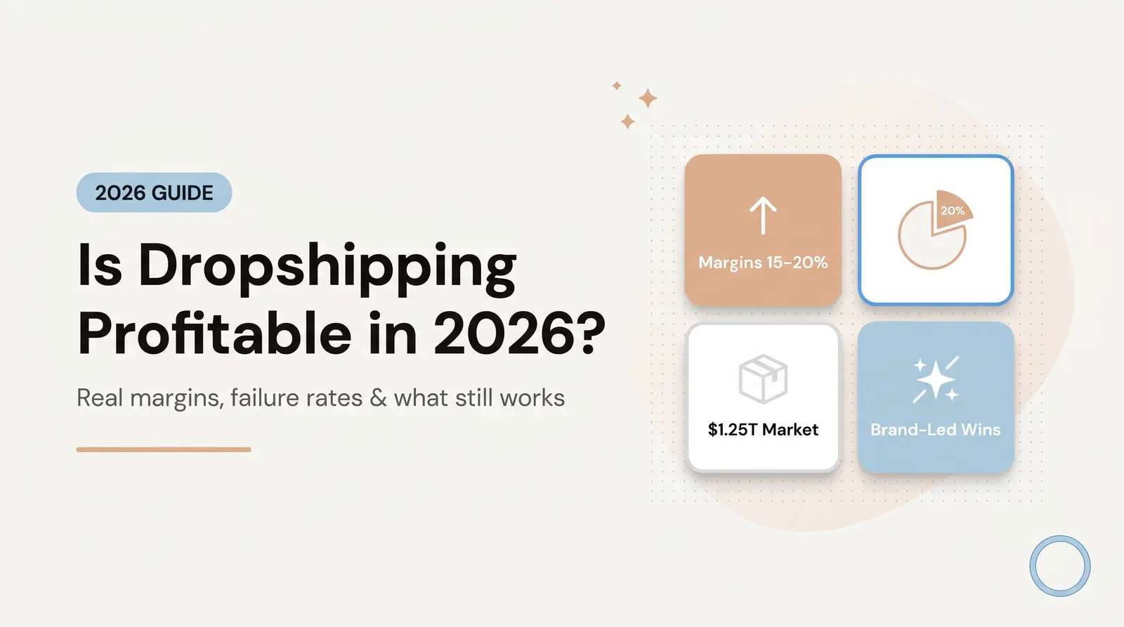
Customers spot generic stores instantly. Learn the 5-layer "Luxury Perception Stack" to transform your dropshipping site from a reseller catalog into a trustworthy, boutique-grade brand.
Published:
January 29, 2026
Author:
Yi Cui
You've built your store, sourced your products, and launched your business. But within seconds of landing on your homepage, potential customers sense something is off. They can't quite articulate it, but they feel it—that unmistakable "dropshipping look" that triggers skepticism instead of trust.
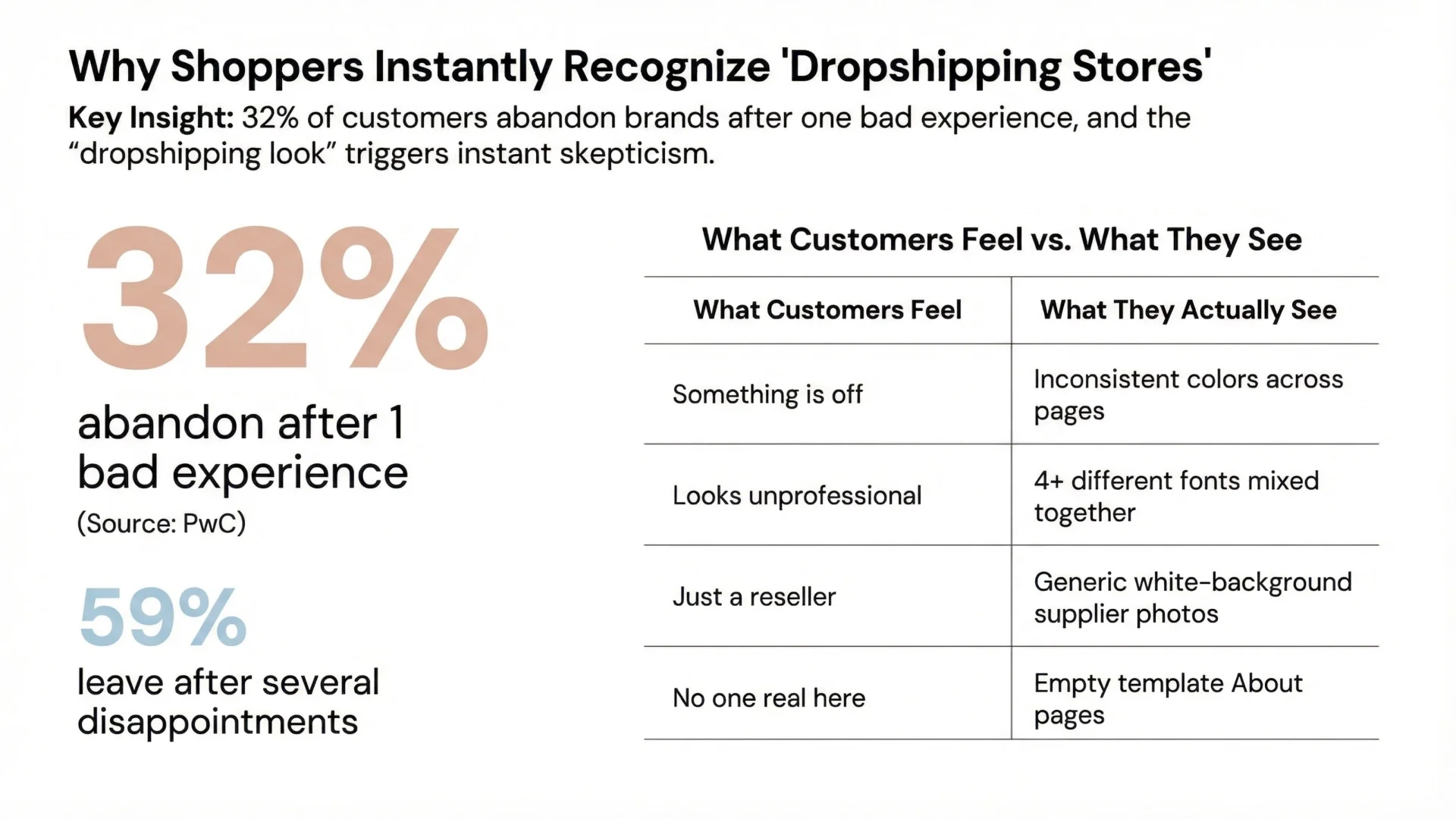
This fear is real, and the stigma is pervasive. Customers don't hate dropshipping as a business model. What they hate are the visual signals of low trust and low effort. When a store feels generic, inconsistent, or hastily assembled, customers instinctively protect their wallets and click away. Research from PwC confirms this harsh reality: 32% of customers will abandon a brand after just one bad experience, while 59% will leave after several disappointing encounters [1].
The good news? The "dropshipping look" is not a business model problem—it's a branding failure. And branding failures can be systematically fixed. In our experience at Branvas, we've seen countless founders transform their stores from generic reseller sites into boutique-grade brands that command premium prices and customer loyalty. The difference isn't artistic talent or massive budgets. It's understanding that branding is systematic, not artistic. It's about consistency, restraint, and visual trust.
This guide will show you exactly how to brand your dropshipping store so it looks and feels like a premium brand—not a reseller catalog.
Before we discuss solutions, let's diagnose the problem. What specific signals make customers immediately recognize a "dropshipping store"? In our experience at Branvas, we've identified the most common culprits:
Inconsistent colors across pages. When your homepage uses navy blue, your product pages feature bright teal, and your checkout has a completely different palette, customers subconsciously register chaos. This visual inconsistency signals that no one is paying attention to details—a red flag for product quality and customer service.
Mismatched or excessive fonts. Using four different typefaces across your site doesn't make you look creative—it makes you look unprofessional. Luxury brands understand that typographic restraint communicates confidence and sophistication.
Generic product photos. Those white-background catalog images straight from your supplier scream "reseller." When every product photo looks identical in style and lighting to thousands of other stores, customers know you're not the source. Research from Nielsen Norman Group emphasizes that product presentation directly impacts perceived value and trust [2].
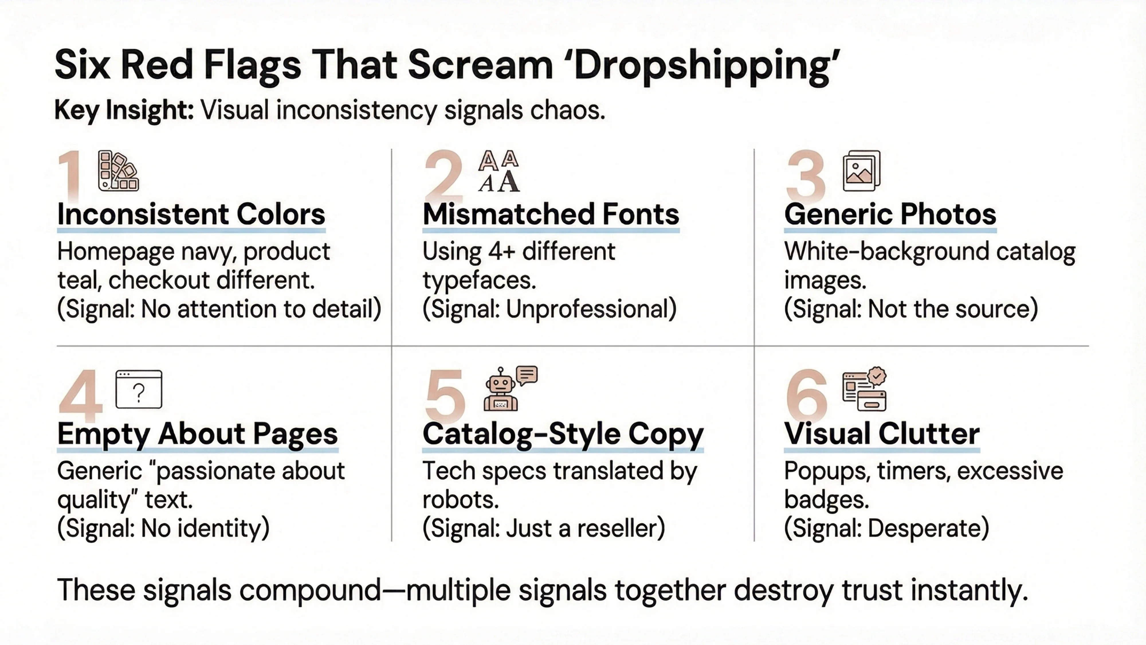
Empty or template About pages. A generic "We are passionate about bringing you the best products" statement tells customers nothing about who you are or why you exist. It's a missed opportunity to build the emotional connection that drives loyalty.
Copy that sounds like a supplier catalog. When your product descriptions read like technical specifications translated by a robot, you're not telling a brand story—you're listing features. Customers buy from brands, not catalogs.
Visual clutter and excessive badges. Ironically, many founders try to build trust by adding more elements—countdown timers, popup notifications, trust badges, and promotional banners. But this approach backfires. We often see founders blame traffic when the real issue is visual trust. The fastest way to make a store feel premium is removing things—not adding them.
These signals compound. A single inconsistency might be forgiven, but when multiple signals appear together, customers make instant judgments about your legitimacy and quality.
To systematically address these branding failures, we've developed what we call the Luxury Perception Stack -- a five-layer framework that explains how customers evaluate brand quality. Each layer builds on the previous one, and breaking any single layer can collapse the entire perception of trust.
This is your foundation—the colors, fonts, spacing, and layout patterns that appear across every page. Visual consistency means using exact color codes, identical typography systems, and predictable spacing rhythms. Research shows that consistent brand presentation increases revenue by 23-33% across all channels [3]. When customers see the same visual language everywhere, their brains register reliability and professionalism.
Your brand narrative answers three questions: Who are you? Why do you exist? Why should customers care? This layer includes your About Us page, your brand voice, and the story you tell through content. According to Shopify research, the About Us page is among the most visited pages on eCommerce sites, yet most dropshipping stores treat it as an afterthought [4].
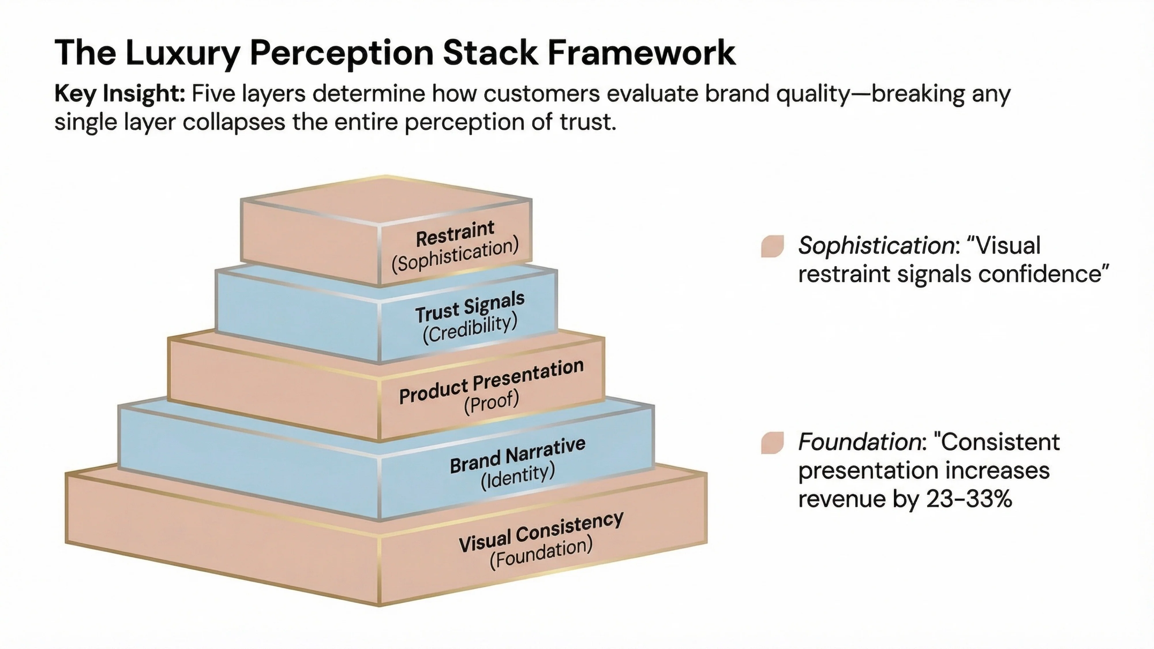
How you present products—image style, background treatment, lifestyle context, and descriptive copy—either reinforces or undermines your brand. Nielsen Norman Group research on luxury eCommerce found that customers need in-context photos to understand product scale and quality. Missing measurements, unexplained jargon, and insufficient photos create frustration that drives customers to competitors [2].
These are the explicit markers of legitimacy: clear return policies, transparent contact information, security badges, and customer reviews. Research indicates that 86% of buyers will pay more for a better customer experience, and trust signals are the foundation of that experience [1].
This is the most counterintuitive layer and the one that separates premium brands from amateur stores. Restraint is about what you choose not to show. No aggressive popups. No countdown timers on every product. No excessive promotional messaging. Luxury brands understand that visual restraint signals confidence. When you're constantly shouting for attention, customers assume you're desperate.
Why this framework matters: When all five layers align, customers perceive your store as a legitimate brand. When even one layer breaks—say, you have beautiful visual consistency but an empty About page—the entire perception collapses. Customers may not consciously identify which layer failed, but they'll feel that something is wrong.
One of the most common mistakes we see founders make is believing that more customization equals better branding. They choose five different colors, three different fonts, and create elaborate visual schemes. The result? Their store looks cheaper, not more premium.
Here's the contrarian truth: fewer choices look more expensive. Luxury brands like Chanel, Hermès, and Rolex use extremely limited color palettes—often just one or two brand colors plus neutrals. This isn't creative limitation; it's strategic restraint.
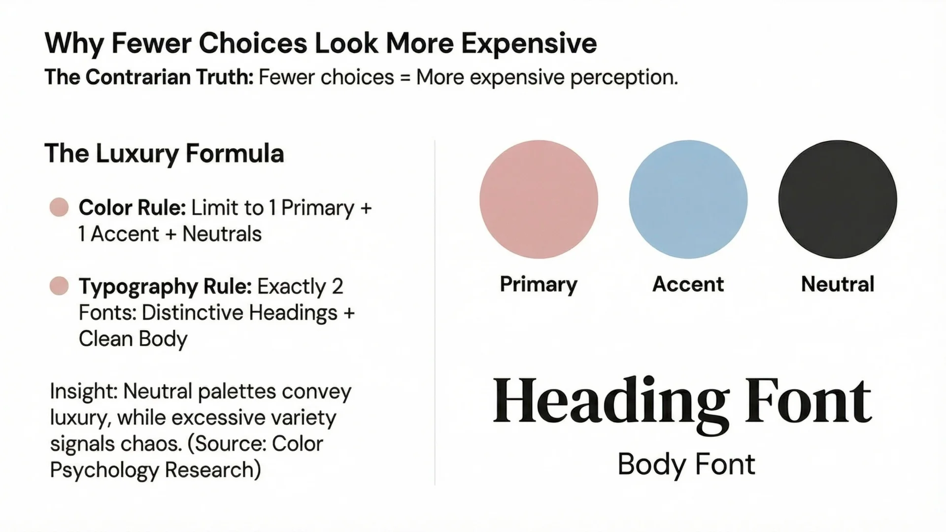
Start with one primary brand color and one accent color. That's it. Then build the rest of your palette with neutrals: black, white, and shades of gray. Research on color psychology shows that neutral palettes convey luxury and sophistication, while excessive color variety signals chaos [5].
For example, if you sell skincare products, you might choose:
Use your primary color for key brand elements (logo, primary buttons), your accent color sparingly for emphasis, and neutrals for everything else. This creates visual harmony that feels intentional and premium.
Typography is where most dropshipping stores fail spectacularly. Using default Shopify fonts or mixing multiple typefaces destroys brand perception. Here's what works:
Use exactly two fonts: one for headings and one for body text. Luxury brands typically pair a distinctive serif or modern sans-serif for headings with a clean, readable sans-serif for body copy. Research on luxury brand typography shows that Bodoni and similar Didone or "modern" serif faces are classic luxury typefaces [6].
Why default Shopify fonts kill brand perception: When customers see the same fonts on hundreds of other stores, they immediately recognize you're using a template. Custom typography (even free Google Fonts that aren't overused) signals that someone made intentional design decisions.
The restraint principle: More fonts don't make you look creative—they make you look confused. Two fonts, used consistently, create sophistication. Five fonts create chaos.
Your product pages are where trust converts to sales. Yet most dropshipping stores simply upload supplier photos and copy-paste descriptions. This approach guarantees you'll be perceived as a middleman, not a brand.
Every product photo should follow the same style guidelines:
If you're sourcing from suppliers with inconsistent photography, you have three options: request consistent images, hire a photographer to reshoot products, or use editing tools to standardize backgrounds and lighting. Yes, this requires effort. That's precisely why it creates competitive advantage.
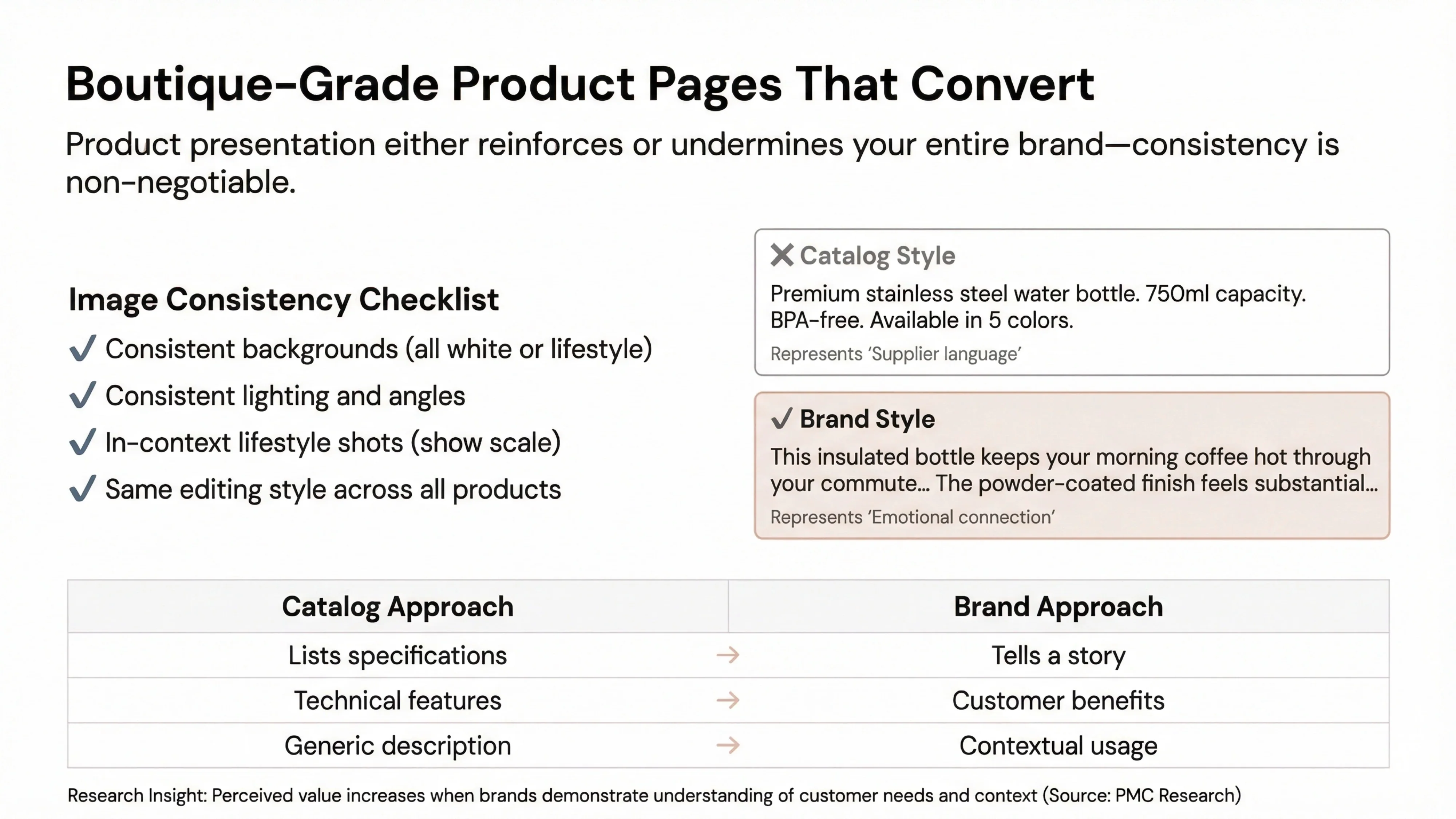
Compare these two approaches:
Catalog style: "Premium stainless steel water bottle. 750ml capacity. BPA-free. Available in 5 colors."
Brand style: "This insulated bottle keeps your morning coffee hot through your commute and your afternoon water cold through your workout. The powder-coated finish feels substantial in your hand, and the leak-proof lid means it's safe in any bag."
The second version tells a story. It helps customers imagine using the product. It sounds like a brand that understands its customers, not a supplier listing specifications.
Research on brand trust confirms that perceived value increases when brands demonstrate understanding of customer needs and context [7]. Your product copy is where you demonstrate that understanding.
In our experience at Branvas, the About Us page is the single most underrated element of dropshipping store branding. Customers visit About pages when they're on the fence about purchasing—they want to know who they're buying from. Yet most dropshipping stores offer nothing but generic platitudes.
Shopify research confirms that About Us pages are among the most visited pages on eCommerce sites [4]. Customers visit for several reasons:
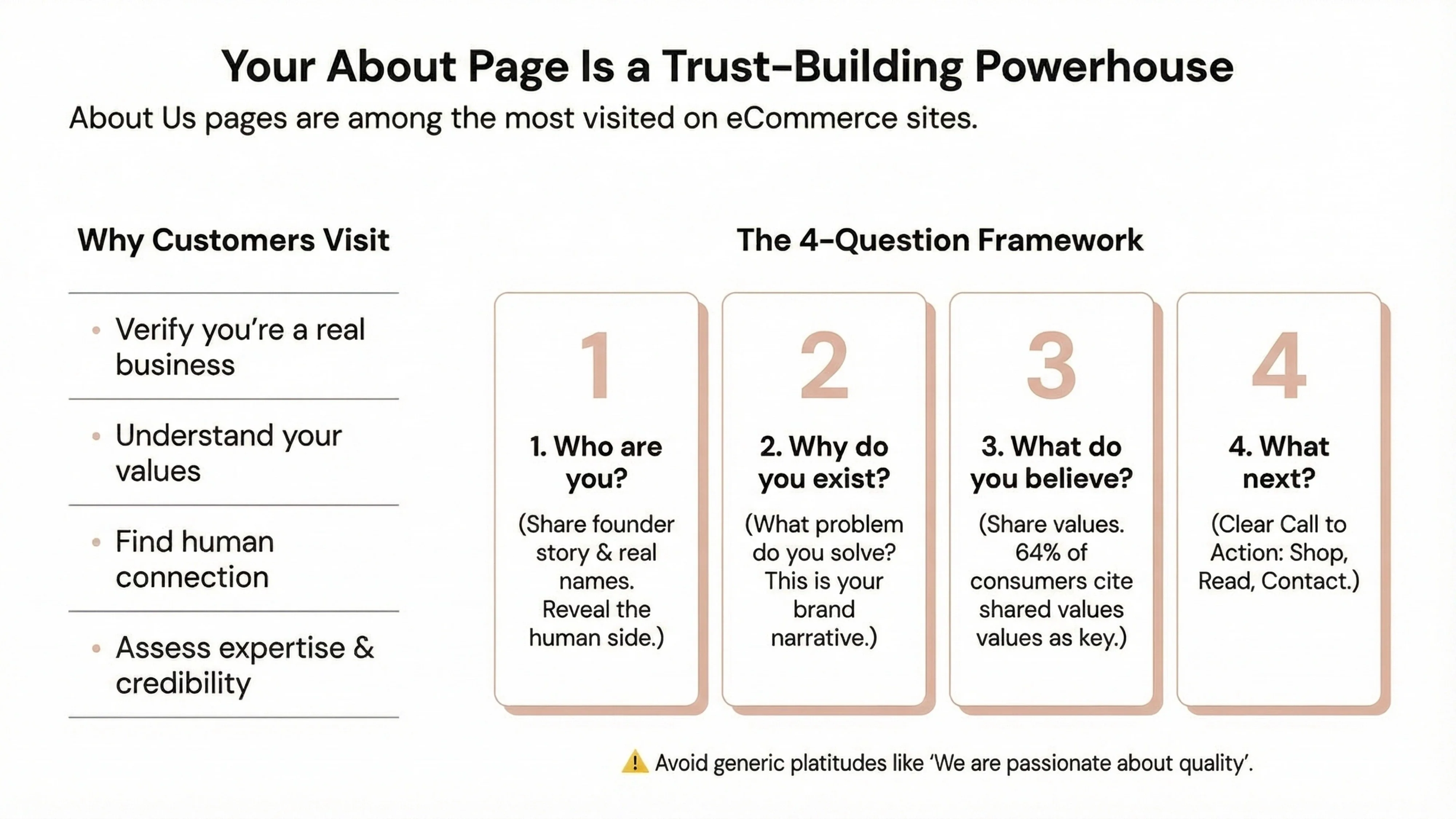
Your About page should answer these questions:
Who are you? Share your founder story or the team behind the brand. Use real names and, if possible, real photos. Research shows that customers feel more connected to brands that reveal the human side of their business [4].
Why do you exist? What problem are you solving? What gap in the market did you see? This is your brand narrative—the story that differentiates you from every other store selling similar products.
What do you believe? Share your values. According to recent research, 64% of consumers cite shared values as the primary reason for brand relationships [8]. If you believe in sustainability, craftsmanship, or accessibility, say so explicitly.
What should customers do next? End with a clear call to action—shop your collection, read customer reviews, or contact you with questions.
A strong About page transforms skeptical visitors into confident buyers. A weak one confirms their suspicions that you're just another dropshipper.
Here's the most contrarian insight in this entire guide: minimal, boring consistency wins over cool design every single time. Founders often believe they need elaborate animations, complex layouts, and eye-catching graphics to stand out. In reality, these elements often cheapen brand perception.
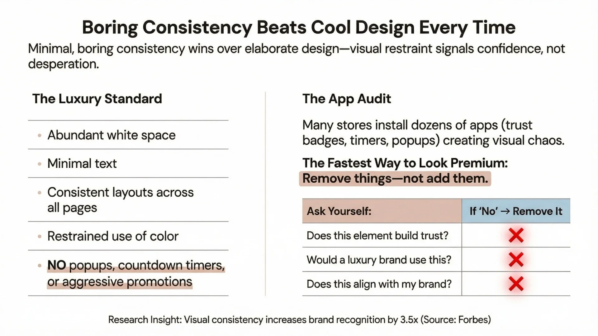
Luxury brands are, frankly, boring in their consistency. Visit any high-end brand's website—Chanel, Rolex, Aesop—and you'll find:
This isn't because luxury brands lack creativity. It's because they understand that visual restraint signals confidence. When you're constantly shouting for attention with popups and promotions, customers assume you're desperate. When you present products calmly and consistently, customers assume you're established and trustworthy.
Many dropshipping stores install dozens of Shopify apps: trust badge apps, countdown timer apps, popup apps, review apps, social proof notification apps. Each app adds visual elements to your store. The cumulative effect? Visual chaos that screams "amateur."
In our experience at Branvas, the fastest way to make a store feel premium is removing things—not adding them. Audit every visual element on your store:
If the answer to any question is no, remove it. Research confirms that visual consistency increases brand recognition by 3.5x [9]. Consistency requires saying no to elements that don't serve your brand, even if they seem helpful in isolation.
At Branvas, we've built our entire service around solving the branding challenge that dropshipping founders face. We understand that most founders don't have design backgrounds or the budget to hire agencies. Yet they need their stores to look professional and trustworthy from day one.
Our approach focuses on brand-ready visuals that maintain consistency across all customer touchpoints. Instead of sourcing generic supplier photos, we provide product imagery that follows consistent style guidelines—same backgrounds, same lighting, same aesthetic. This immediately elevates perceived brand quality.
We also help with packaging and unboxing alignment. One of the biggest disconnects in dropshipping happens when customers receive generic packaging that doesn't match the premium brand experience they saw online. We work with founders to ensure that physical products reinforce the brand promise made digitally.
Most importantly, we help founders focus on brand, not assets. Instead of spending hours searching for product photos, editing images, or trying to create consistency across suppliers, founders can focus on the strategic work of building their brand narrative, understanding their customers, and growing their business.
Our experience working with hundreds of founders has taught us that branding isn't about having the most elaborate design—it's about having the most consistent one. When every element of your store reinforces the same brand identity, customers trust you. When elements conflict, they leave.
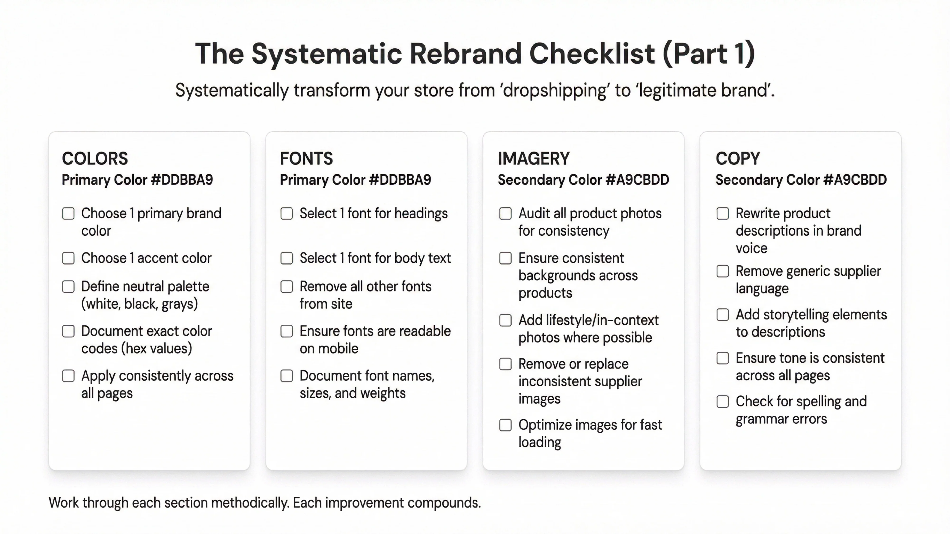
Ready to transform your dropshipping store into a boutique-grade brand? Follow this systematic checklist:
☐ Choose 1 primary brand color
☐ Choose 1 accent color
☐ Define your neutral palette (white, black, grays)
☐ Document exact color codes (hex values)
☐ Apply consistently across all pages
☐ Select 1 font for headings
☐ Select 1 font for body text
☐ Remove all other fonts from your site
☐ Ensure fonts are readable on mobile
☐ Document font names, sizes, and weights
☐ Audit all product photos for consistency
☐ Ensure consistent backgrounds across products
☐ Add lifestyle/in-context photos where possible
☐ Remove or replace inconsistent supplier images
☐ Optimize images for fast loading
☐ Rewrite product descriptions in your brand voice
☐ Remove generic supplier language
☐ Add storytelling elements to descriptions
☐ Ensure tone is consistent across all pages
☐ Check for spelling and grammar errors
☐ Write a compelling About Us page with your story
☐ Create a clear, generous return policy
☐ Add a comprehensive FAQ page
☐ Ensure contact information is easy to find
☐ Add a privacy policy and terms of service
☐ Add customer reviews (even if you start with testimonials)
☐ Display security badges at checkout
☐ Show clear shipping information
☐ Provide multiple payment options
☐ Include real contact information
☐ Remove unnecessary popups
☐ Eliminate countdown timers (unless genuinely limited)
☐ Reduce promotional messaging
☐ Remove excessive trust badges
☐ Simplify navigation
This checklist transforms stores systematically. Work through each section methodically rather than trying to fix everything at once. Each improvement compounds, gradually shifting customer perception from "dropshipping store" to "legitimate brand."

Branding your dropshipping store requires systematic attention to visual consistency, brand narrative, and trust signals. Start by choosing a limited color palette (1-2 brand colors plus neutrals) and exactly two fonts. Ensure all product photos follow consistent style guidelines. Write a compelling About Us page that shares your story and values. Remove visual clutter like excessive popups and badges. Focus on restraint and consistency rather than elaborate design. Research shows that consistent brand presentation increases revenue by 23-33% [3].
Your store likely looks cheap due to visual inconsistency, not lack of design sophistication. Common culprits include mismatched colors across pages, too many different fonts, generic supplier photos with inconsistent backgrounds, empty or template About pages, and excessive visual clutter from apps and badges. Customers perceive these signals as low effort, which translates to low trust. The solution is systematic consistency across all brand touchpoints, not more elaborate design.
Luxury brands follow principles of restraint, consistency, and attention to detail. They use limited color palettes (typically 1-2 colors plus neutrals), minimal typography (2 fonts maximum), abundant white space, and consistent product presentation. Nielsen Norman Group research on luxury eCommerce emphasizes that luxury brands prioritize visual consistency and avoid interruptions like aggressive popups [2]. They focus on what they don't show as much as what they do show—restraint signals confidence and sophistication.
Yes, significantly. Research demonstrates that consistent brand presentation increases revenue by 23-33% across all channels [3], while 68% of companies report 10-20% revenue growth from brand consistency initiatives [8]. Additionally, 86% of buyers will pay more for a better customer experience [1], and brand trust directly impacts purchasing decisions. PwC research shows that 32% of customers will abandon a brand after just one bad experience [1]. Strong branding reduces friction in the buying decision and increases perceived value.
Absolutely. The "dropshipping look" is a branding failure, not an inherent limitation of the business model. Successful dropshipping stores look like real brands by maintaining visual consistency, telling authentic brand stories, presenting products professionally, and exercising restraint in design. The key is treating your store as a brand from day one rather than as a product catalog. With systematic attention to the Luxury Perception Stack—visual consistency, brand narrative, product presentation, trust signals, and restraint—any dropshipping store can achieve boutique-grade brand perception.
[1] PwC. (2023). Future of Customer Experience Survey. Retrieved from https://www.pwc.com
[2] Moran, K. (2022). Applying Luxury Principles to Ecommerce Design. Nielsen Norman Group. https://www.nngroup.com/articles/luxury-principles-ecommerce-design/
[3] Lucidpress. (2021). The Impact of Brand Consistency: Revenue Increase Research. https://www.lucidpress.com
[4] Shopify. (2022). 9 Ways To Build Customer Trust When You Have Zero Sales. https://www.shopify.com/blog/customer-trust-new-business
[5] Smartpress. (2025). Color Psychology: How to Use It for Marketing & Sales. https://smartpress.com/blog/features/color-psychology-how-to-use-it-for-marketing-sales
[6] Dirty Line Studio. (2025). Luxury Brand Typography: Lessons from Chanel, Dior, and More. https://dirtylinestudio.com/luxury-brand-typography/
[7] García-Salirrosas, E.E., et al. (2024). The impact of perceived value on brand image and loyalty. PMC. https://pmc.ncbi.nlm.nih.gov/articles/PMC11484097/
[8] Envive AI. (2025). 40 Brand Voice Consistency Statistics in eCommerce in 2025. https://www.envive.ai/post/brand-voice-consistency-statistics-in-ecommerce
[9] Forbes. (2024). The Importance Of Consistency In Branding. https://www.forbes.com/councils/forbescommunicationscouncil/2024/12/30/the-importance-of-consistency-in-branding/